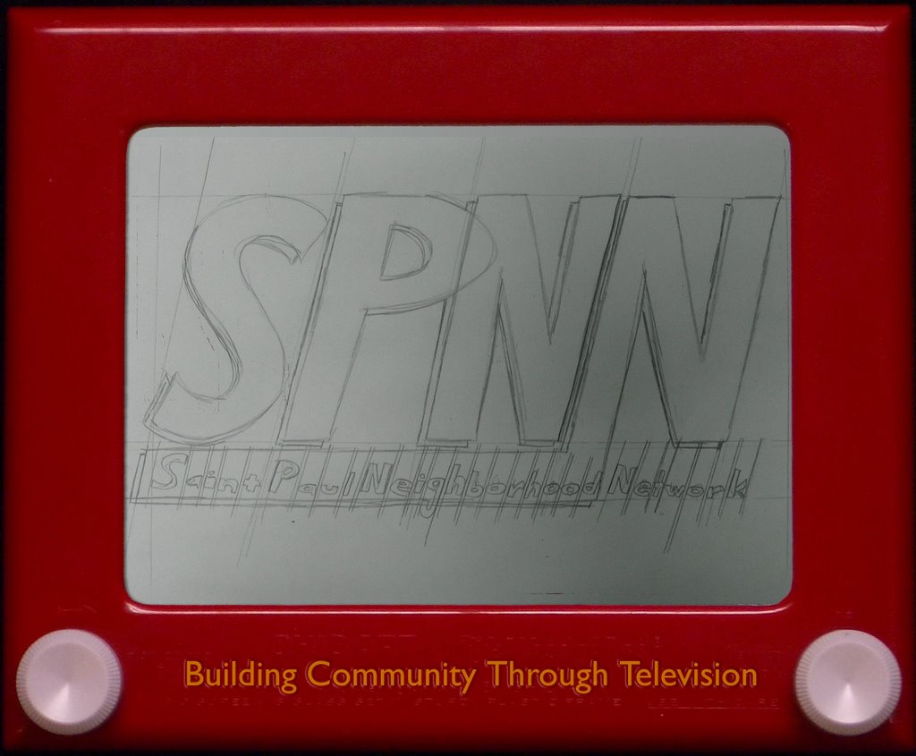
Here's the second draft of our design for the new mousepads in the media lab. Bekka did the pencil sketch of the SPNN logo, and then I put it into an etch-a-sketch. I'm having a hard time getting the "Building Community Through Television" to look right. What do you guys think?

2 comments:
I think it looks super mega ultra awesome the way it is. Maybe you are being picky because the yellow text on an etch-a-sketch is traditionally at the top of the screen, though for SPNN I really like it at the bottom. It makes more sense to me.
Maybe you should add the word "magic", like in "Magic Etch A Sketch Screen".
I don't know where it would go though.
Did you do that in photoshop?
It looks awesome. I think what you might be missing, though, is the golden glimmer of the etch a sketch logo. It's a hard magic to capture, though--you might have gotten as close as humanly (and non-etch-a-sketchily) possible.
Post a Comment